AI Planner Cover Designs That Sell on Etsy
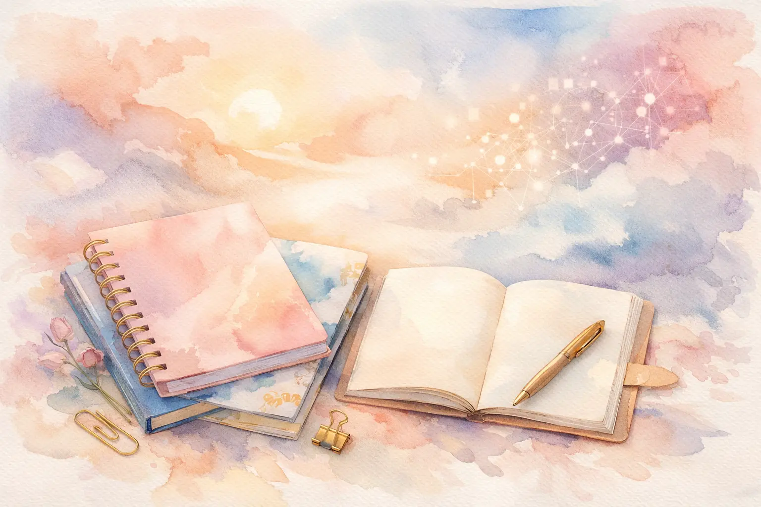
A planner cover is the first thing a buyer sees in Etsy search, and it often decides whether they click or keep scrolling. Strong AI planner cover designs do more than look pretty. They tell buyers exactly who the planner is for, what mood it brings to their routine, and why it belongs in their cart.
For sellers, that makes covers one of the highest-leverage digital products you can create. A single visual direction can become dated covers, undated covers, printable inserts, matching dashboard pages, stickers, and a full planner bundle. The opportunity is not simply making one attractive image. It is building a coordinated product line without spending your weekend manually designing every variation.
Why planner covers are a smart Etsy product
Planner buyers are usually shopping with a purpose. They may want a clean budget binder, a cheerful teacher planner, a faith journal, a wedding organizer, or a wellness tracker that feels personal. The cover gives them an immediate emotional answer: this was made for me.
That is why generic designs can struggle, even when they are technically well made. A random floral pattern has broad appeal, but a "soft blue wildflower teacher planner cover" gives a buyer a clearer reason to choose it. Specificity helps your listings stand out and helps you create related products that make sense together.
Planner covers also work well as digital inventory because the production model is flexible. You can offer a printable PDF cover, a PNG for digital planning apps, a resizeable insert, or a bundle with multiple colorways. The best format depends on your audience, but the underlying artwork can support all of them.
Start with a buyer, not an art prompt
The fastest way to fill your shop with mismatched inventory is to generate whatever looks interesting in the moment. Before creating AI planner cover designs, decide who the collection serves and where they will use it.
Think in practical buyer groups: busy moms organizing family schedules, students managing assignments, entrepreneurs tracking content, nurses planning shift work, or readers building a book journal. Then choose a design language that fits that buyer. A corporate goal planner may need structured typography, restrained color, and clean geometry. A cottagecore reading journal can carry softer paper texture, vintage botanicals, and a warmer palette.
This gives the AI a useful creative direction, but it also gives your shop a product strategy. Instead of listing ten unrelated covers, you can create one collection with a recognizable point of view.
Build around themes that support bundles
A strong theme has enough depth to produce several coordinated assets without becoming repetitive. For example, a celestial productivity collection could include a navy moon-phase cover, a lavender constellation cover, neutral star-pattern dashboards, transparent PNG stickers, and matching monthly divider art.
The covers become the entry product. The matching extras raise the perceived value of your bundle and give returning buyers a reason to browse more of your shop. This is where collection thinking beats creating isolated images one at a time.
What makes a cover look finished
AI can create striking art quickly, but Etsy-ready planner covers still need design decisions. Buyers notice when a cover feels crowded, when text is hard to read, or when the artwork does not leave enough room for personalization.
Start with a clear visual hierarchy. The planner title should be readable at thumbnail size. Decorative art should support the title instead of competing with it. If you plan to offer name personalization, leave intentional blank space where a buyer's name can sit naturally.
Color matters just as much. Pick a limited palette and repeat it across the collection. You do not need every cover to match perfectly, but they should look like they came from the same shop. One dusty pink floral cover, one sage green floral cover, and one warm cream floral cover can work together. Add a neon cyberpunk option to that set and the collection starts to lose focus.
Texture is another trade-off. A handmade paper look, watercolor wash, or vintage grain can add personality, especially for junk-journal or boho audiences. But too much texture can muddy small text or print poorly on a home printer. Use texture in the background and keep your important text zones clean.
Create variations buyers actually want
Variation is where AI gives a planner-cover shop real momentum. Do not make twenty near-identical covers just because you can. Make variations that solve different buyer preferences.
A useful collection may include several colorways, seasonal editions, dated and undated versions, and cover text options such as Daily Planner, Wellness Journal, Budget Book, or 2026 Planner. You can also offer a no-text version for buyers who want to add their own title in a digital planning app.
Keep the core visual system stable while changing one meaningful element at a time. For a retro fruit theme, that might mean the same layout with cherries, lemons, strawberries, and oranges. For a minimalist abstract collection, it may mean terracotta, olive, navy, and blush colorways. This approach creates choice without making your production process messy.
Avoid the common AI cover mistakes
AI-generated cover art can have issues that are easy to miss while you are focused on the overall image. Check every final design for distorted objects, accidental symbols, unreadable generated lettering, awkward cropping, and inconsistent decorative details.
Do not rely on AI-generated text for your final cover title. Generate the art, then use a title and layout editor to place clean, readable wording. This protects your professionalism and makes it easier to create multiple product versions from the same background.
Also think about the actual file a buyer receives. A gorgeous square image may not work for a US Letter printable planner. Decide on your intended dimensions first, then create or crop the artwork for that format. If you sell digital planner covers for tablet use, confirm the aspect ratio and export size your audience expects.
Turn one concept into a sellable collection
The old workflow for planner covers is slow: brainstorm, prompt, generate, download, edit, remove backgrounds, resize, add text, export, and repeat. That is manageable for one listing. It becomes a bottleneck when you need enough coordinated products to make your Etsy shop feel established.
InkEngine is built around the collection workflow instead. Start with one text idea or a reference image, create a coordinated series, refine the assets, add your titles, and export files ready for your product setup. You are not juggling separate AI generators, editing tools, and design subscriptions to get one cover across the finish line.
That matters when you have a niche that is working. If a vintage garden planner gets traction, you should be able to create matching weekly inserts, sticker sheets, journal paper, and alternate cover colors while the idea is still fresh. Production should support your momentum, not slow it down.
For printable products, make sure your final files are high resolution and prepared at 300 DPI. For digital sticker or embellishment bundles, clean transparent PNGs may be more useful. Export the files in the formats your listings promise, and organize them clearly before you upload. Buyers remember a smooth download experience, especially when they are purchasing a bundle.
Write listings that match the cover's promise
Your listing photos and product title should carry the same message as the design. If the cover is made for a teacher planner, show it in a teacher-planning context. If it is a neutral finance binder cover, use mockups that make the use case obvious.
Be clear about what is included. State whether the product is a printable cover, a digital planner cover, an editable template, or a bundle of files. Mention dimensions, file types, and whether the planner pages themselves are included. Confusion creates disappointed buyers and avoidable messages.
Keywords should describe the product as a buyer would search for it, but do not stuff every phrase into the title. Use specific language tied to theme, audience, and format. A buyer looking for a floral budget binder cover is more qualified than someone searching a vague term like "pretty planner art."
Make your covers part of a repeatable system
The goal is not to chase every aesthetic trend. It is to develop a repeatable way to spot a viable niche, create a visual direction, build useful variations, finish the files, and publish a collection that feels intentional.
When a cover style performs, expand it thoughtfully. When it does not, you have still created assets that may work as dashboards, clip art, wall art, or a future seasonal bundle. Each collection teaches you more about what your buyers respond to.
Your best planner cover may begin as one simple idea. The business value comes from turning that idea into organized, consistent inventory that gives buyers more reasons to choose your shop and gives you more time to build what comes next.
Fill your shop with a matching collection this weekend.
Start your first collectionFree to start. No credit card.