How to Make Printable Wall Decor That Sells
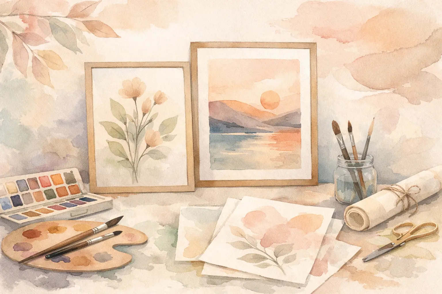
A shopper gives your Etsy thumbnail about a second before deciding whether to click. That is why learning to make printable wall decor is not just about creating a pretty image. It is about building a clear product that looks intentional, fits a buyer’s room, and gives them an easy reason to purchase now.
The sellers who fill their shops consistently are not starting from scratch for every listing. They choose one marketable direction, turn it into a coordinated collection, finish the files correctly, and publish. That process protects your time while helping your shop look more established.
Make Printable Wall Decor as a Collection, Not a One-Off
A single quote print can sell. A set of matching quote prints, nursery animals, botanical studies, or retro travel posters gives buyers more ways to say yes. It also gives you multiple listings, bundle opportunities, and a recognizable visual identity without needing a completely new idea every day.
Start with a buyer and a room. “Wall art” is too broad to guide a strong design. “Warm neutral kitchen prints for a modern farmhouse apartment” is much more useful. So is “playful dinosaur decor for a toddler’s bedroom” or “minimalist blue coastal art for a beach house entryway.”
That level of specificity affects everything: color palette, subject matter, typography, framing style, and the words a shopper will search. It keeps your collection from becoming a random folder of images that happen to share a theme.
Before you create anything, write a one-sentence collection brief. Include the subject, style, color direction, intended room, and buyer. For example: “A set of soft watercolor wildflower prints in dusty pink, sage, and cream for feminine bedroom and dorm decor.” That brief is your filter. If a design does not belong in that sentence, it probably does not belong in the collection.
Pick a Niche With Room to Expand
The best printable decor ideas are specific enough to feel made for someone, but flexible enough to become a set. A niche that supports only one image creates more work for every new listing. A niche with visual range lets you produce coordinated assets faster.
Think in families of designs. A vintage fruit collection can include lemons, pears, cherries, oranges, and figs. A celestial nursery collection can include moons, stars, clouds, planets, and gentle affirmations. The buyer sees options; you see a repeatable production lane.
Avoid choosing a niche only because it looks popular in search results. High-demand categories can be crowded, and broad themes often force you into price competition. A more defined angle can be easier to position. Instead of generic abstract art, consider textured earth-tone abstract prints for a neutral living room. Instead of generic flower art, consider moody vintage florals for dark academia decor.
There is a trade-off here. Go too broad and your work blends in. Go too narrow and you may run out of product ideas or limit your audience. The sweet spot is a theme that has a distinct point of view and at least six to 12 possible designs.
Plan the Set Before You Generate
Map the series first, even if you are using AI to create the artwork. Decide which images are hero pieces, which are supporting pieces, and which could work as a bundle. This stops you from generating ten versions of the same composition and calling it a collection.
For a six-print set, vary the subject while holding the style steady. You might use three detailed focal pieces, two simpler companion prints, and one typography-based design. Every print should look good alone, but the group should look better together.
Keep consistency visible. Use the same palette, similar line weight or texture, related framing space, and a shared mood. A coordinated set does not mean every print is identical. It means a buyer can picture all of them on the same wall.
Build a Visual System That Looks Intentional
Printable wall decor often fails at the details buyers cannot name immediately: muddy colors, inconsistent backgrounds, awkward empty space, or text that feels disconnected from the artwork. Solve those issues at the system level instead of trying to rescue each file later.
Choose two or three main colors plus one accent. Decide whether your backgrounds are warm white, bright white, cream, or transparent. Pick a visual treatment, such as grainy watercolor, bold paper-cut shapes, vintage engraving, or clean mid-century forms. Then repeat those decisions across the collection.
Typography deserves the same discipline. If your collection includes text, use one headline style and one supporting style at most. Make sure the message is readable at thumbnail size. A clever phrase that disappears in a search grid is not doing its job.
Leave room around the main subject. Buyers need artwork that feels balanced once it is placed in a frame, not crammed edge to edge. Negative space is especially valuable for minimalist decor, nursery art, and typography prints. For maximalist work, density can be part of the appeal, but it still needs a clear focal point.
Create, Finish, and Export Print-Ready Files
A beautiful preview is not yet a product. Your customer is paying for a digital file they can print, frame, and enjoy. Technical preparation is where many new shops lose trust, create extra customer-service work, or earn disappointing reviews.
Build your designs at high resolution and export at 300 DPI for print quality. Your file should be large enough for the sizes you promise. If you sell a 16 x 20 inch print, make sure the pixel dimensions can support that size at 300 DPI rather than stretching a small image and hoping for the best.
Offer the aspect ratios your buyer is likely to need. You do not need every possible size for every listing, but a useful wall-art package usually covers common frame formats. Four distinct ratio groups are often enough:
- 2:3 ratio for sizes such as 4 x 6, 8 x 12, 12 x 18, and 16 x 24
- 3:4 ratio for sizes such as 6 x 8, 9 x 12, 12 x 16, and 18 x 24
- 4:5 ratio for sizes such as 4 x 5, 8 x 10, 12 x 15, and 16 x 20
- International A-series files for buyers printing A5 through A2 sizes
JPEG files are usually the practical choice for finished wall art with a background. PNG is better when transparency is part of the product, such as separate decorative elements, clip art, or artwork intended for layered uses. Name every file clearly so buyers know exactly what they are opening. “Wildflower-Print-4x5-16x20.jpg” is far more helpful than “final_v7.jpg.”
If your original work needs cleanup, do it before exporting every size. Check for unwanted marks, distorted details, broken text, uneven borders, and low-resolution areas. Also view the design at 100% zoom. What looks fine on a small screen can look rough once printed.
InkEngine can turn one creative direction or reference image into coordinated, print-ready collection assets, then help you finish layouts, upscale artwork, and export the formats your Etsy workflow needs. The point is not to replace your taste. It is to remove the repetitive production steps that keep good ideas stuck in drafts.
Turn One Collection Into More Listing Opportunities
You do not need to create more art to create more product options. One coordinated set can support individual prints, a full bundle, a paired set, and different room-focused listings when the artwork genuinely fits those uses.
A three-piece set may appeal to a buyer decorating above a bed. The same artwork sold individually can serve someone filling one small frame. A six-piece bundle can become a higher-value option for a gallery wall. Price and package each option based on the value it delivers, not simply on how long the original image took to make.
Your listing images should make the buying decision easier. Lead with a clean mockup that shows the mood and scale of the artwork in a realistic room. Follow it with close-ups, size information, what files are included, and a straightforward digital-download notice. Do not hide the format details in a long description. Buyers should understand what they receive before they checkout.
Be accurate about what the customer is purchasing. If frames are not included, say so. If colors may vary by monitor or printer, say so. Clear expectations protect your reviews and make your shop feel professional.
Avoid the Fast Mistakes That Slow Down Sales
The fastest way to make printable wall decor is not to skip quality control. It is to stop spending time on work that will not improve the final product. Do not create a new visual style for every listing. Do not offer a giant zip folder with confusing filenames. Do not use trendy phrases without checking whether they are overused, protected, or mismatched with your buyer.
Be careful with commercial use as well. Use tools and source material with terms that support your intended use, and avoid recognizable branded characters, logos, and protected designs. An AI-generated image still needs your judgment. Your shop reputation is tied to every file you publish.
Most of all, do not wait for a perfect 50-product shop before listing. Build one focused collection, make the files easy to use, and get it in front of buyers. The next collection will be faster because you will already have a production system, a clearer point of view, and a little more of your weekend back.
Fill your shop with a matching collection this weekend.
Start your first collectionFree to start. No credit card.