A Guide to Cohesive Collections That Sell on Etsy
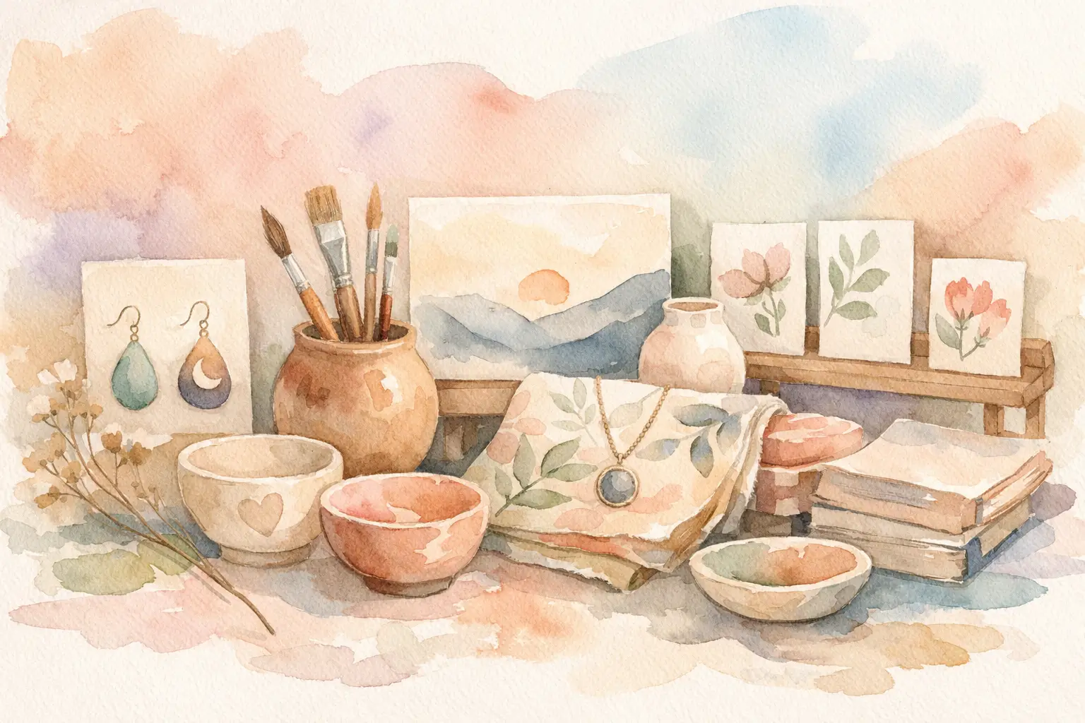
A single pretty printable can earn a sale. A coordinated set of products can give shoppers a reason to stay in your shop, add more to their cart, and remember your style. This guide to cohesive collections is for Etsy sellers who want to turn one good idea into inventory that looks intentional, not like a folder of unrelated experiments.
The difference matters because Etsy buyers rarely shop with one isolated need. Someone who buys a woodland nursery print may also want matching clip art, a name sign, a set of nursery cards, or a planner cover in the same mood. When your products already work together, you make the next purchase easy.
What Makes a Collection Feel Cohesive?
Cohesion is not about making every file identical. It is about giving every product a shared visual language. A customer should be able to see three listings from your shop and immediately understand that they belong to the same family.
That visual language usually comes from a few repeatable choices: the main theme, color palette, illustration style, subject matter, composition, and level of detail. A pastel watercolor garden collection, for example, might include florals, butterflies, bows, and cottage elements. The products can change, but the brush texture, soft colors, and romantic scale stay consistent.
Think of a collection as a small product universe. Your hero artwork establishes the rules. Every additional asset should follow those rules closely enough to match, while bringing enough variety to feel worth buying.
The common mistake is creating each listing from scratch. One day it is a retro mushroom printable. The next day it is a minimalist botanical set. Then comes a neon birthday bundle. There is nothing wrong with testing ideas, but a shop made entirely of one-offs makes it harder to build bundles, cross-sell products, and create a recognizable brand.
Start With a Buyer, Not Just an Aesthetic
Before choosing colors or generating images, decide who is buying and what they are trying to make. “Cute animals” is an aesthetic direction. “Woodland baby shower invitation makers who need matching décor and clip art” is a sellable direction.
This step keeps your collection from becoming a random pile of matching assets. It also tells you which formats to create. A teacher-ready classroom set may need border elements, labels, posters, and stickers. A junk-journal collection may need patterned papers, ephemera, tags, and collage pieces. A wall art theme may expand into several print sizes, coordinating sets of three, and personalized versions.
Ask one practical question: what else would the same buyer need after purchasing the first item? Your answer is the start of your collection plan.
Choose one clear creative anchor
Your anchor can be a text idea, a trend, a color story, or a reference image with the right mood. Keep it specific enough to guide decisions. “Vintage autumn” leaves too much room for drift. “Muted 1970s harvest florals with warm rust, olive, cream, and hand-painted texture” gives you usable boundaries.
A good anchor includes a subject, a style, a palette, and a feeling. You do not need a long prompt document or an art degree. You need a direction you can repeat.
For example, a spring collection might be anchored by “whimsical blue-and-white chinoiserie bunnies with delicate florals.” From there, your product ideas become clearer: bunny wall prints, transparent PNG elements, repeating digital papers, sticker sheets, gift tags, and planner covers. Every item serves the same shopper and stays inside the same visual world.
Build the Collection Before You Build Every File
You can save hours by planning the product family first. Do not generate 40 images and hope they turn into listings later. Decide what the collection needs, then produce with a purpose.
For most digital-product collections, start with a hero product and add complementary formats. The hero might be a printable wall art set, a clip-art bundle, or a pack of digital papers. Then create products that reuse the same visual direction in different ways.
A useful first collection could include:
- One hero bundle with the clearest buyer value
- Several individual or smaller listings that lead shoppers into the bundle
- A coordinating product type for a related use case
- A seasonal, personalized, or print-on-demand variation when it fits the theme
This approach gives you both higher-value bundles and lower-commitment entry points. A buyer may find a single floral PNG first, then return for the full clip-art set. Or they may buy the paper pack and notice matching journal cards in your shop.
There is a trade-off here. More formats can mean more listing opportunities, but only if the buyer can understand what each product is for. If your niche does not naturally support stickers or planner covers, do not force them into every collection. Expand where the theme and customer demand support it.
Keep Style Consistent Without Making Products Repetitive
The goal is consistency, not copy-and-paste. Repeat the visual rules while changing the content inside them.
If you are making a Christmas watercolor collection, keep the same paint texture, palette, lighting, and level of detail across ornaments, stockings, gingerbread houses, and wreaths. Change the pose, object, layout, and supporting details. That is how you create variety without losing the match.
Watch for the details buyers notice immediately. A collection can fall apart when some images have crisp vector lines and others have soft painterly edges. The same happens when one asset uses saturated primary colors while the rest use dusty pastels, or when the scale changes wildly from tiny delicate motifs to oversized bold objects.
Set a few non-negotiables before production. Choose your palette range, background treatment, art style, and amount of visual density. You can also decide whether your collection uses white space, decorative frames, shadows, or text. These simple constraints make faster decisions later.
This is where a collection-focused workflow beats bouncing between disconnected tools. InkEngine can take one text direction or reference image and generate coordinated visual assets, helping sellers create a full product family instead of manually chasing a match across one image at a time.
Finish for the Product Type You Are Selling
Cohesive artwork is only half the job. A file that looks good in a preview but is awkward for the buyer to use will create frustration, weak reviews, and extra messages in your inbox.
Match the finish to the format. Clip art buyers generally need clean transparent PNGs with usable individual elements. Printable wall art buyers need high-resolution files sized for common print ratios. Digital paper buyers need consistent full-page designs without accidental seams, blur, or uneven borders. Sticker and print-on-demand designs need clean edges and a composition that still reads at a smaller size.
Use 300 DPI output for print-focused products, and check every export before listing. Look for odd hands, warped lettering, unintentional background artifacts, fuzzy edges, and assets that are too similar to count as a real bundle. AI can speed production dramatically, but your seller judgment is still what turns generated art into a product people trust.
Naming matters, too. Keep files organized by collection and product type. When a customer downloads 40 files, clear names make your shop feel professional. They also make it much easier for you to create updates, bundle files, and customer support responses later.
Merchandising Is Part of Cohesion
Your Etsy presentation should make the collection visible at a glance. Use a consistent thumbnail style, similar mockup choices, and related cover text across matching listings. A shopper should not have to guess that your baby animal clip art coordinates with your nursery prints.
That does not mean every thumbnail needs the same layout. Your wall art listing needs to show the art in a room or frame. Your clip-art listing needs to show the included elements clearly. Your digital paper listing needs to show pattern variety. The job of the thumbnail changes by product, but the colors, fonts, and overall energy should still feel connected.
Use product titles and descriptions to explain the relationship naturally. Mention when a listing is part of a matching series, and show enough preview images to prove the bundle has range. Be specific about included files, dimensions, formats, and whether backgrounds are transparent. Clear details reduce hesitation at checkout.
Create a Repeatable Collection Rhythm
You do not need to invent a new visual identity for every listing. A smarter shop rhythm is to choose one focused collection, build its strongest formats, publish the core listings, and then move to the next theme. Return later to extend collections that get views, favorites, and sales.
This gives you real data. If a strawberry coquette clip-art set gets attention but the matching papers do not, you may have a clip-art-led audience. If your wall art sets sell best in groups of three, build future collections around coordinated trios. Your shop becomes easier to scale when you let buyer behavior shape your production plan.
Start your next collection with one idea your customer can instantly recognize. Give it a few clear visual rules, create products that solve related needs, and finish every file like someone is ready to use it tonight. That is how a single creative spark becomes a shop section buyers want to come back to.
Fill your shop with a matching collection this weekend.
Start your first collectionFree to start. No credit card.