How to Build Cohesive Clip Art Collections
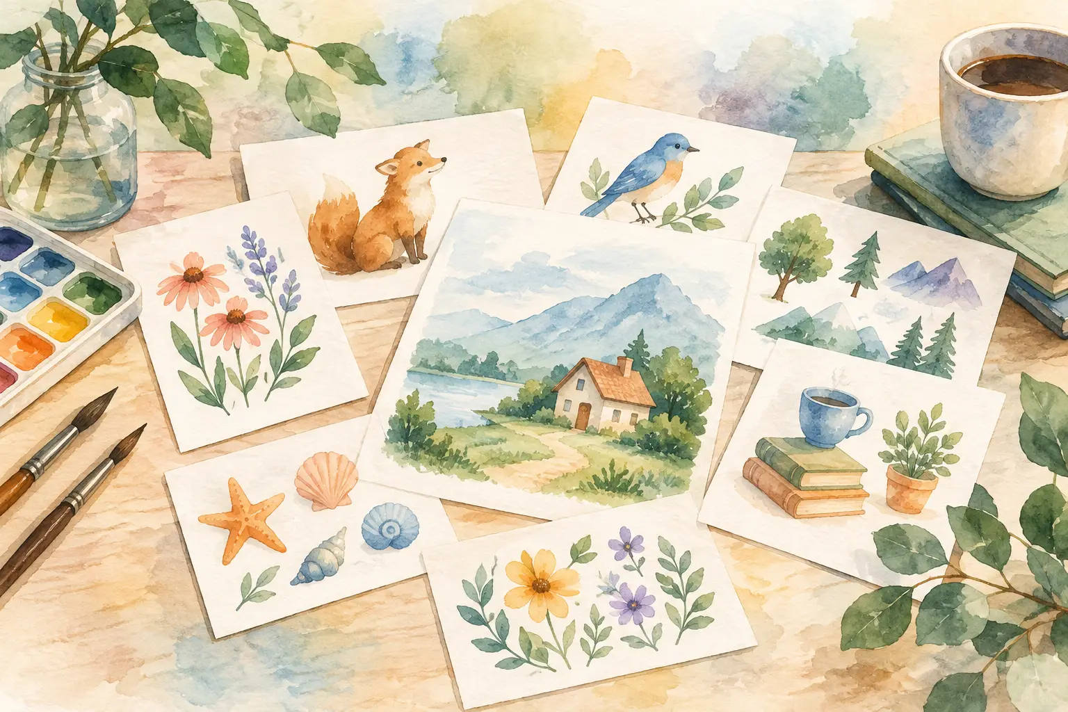
A clip art bundle can have 40 individually pretty images and still feel impossible to sell. The issue is rarely effort. It is usually that the files were made one at a time, with slightly different colors, line weights, moods, and subject choices. To build cohesive clip art that buyers recognize as a complete set, you need a collection plan before you generate the first flower, animal, icon, or object.
For Etsy sellers, cohesion is not a design-school concept. It is what makes a bundle look worth the price. It helps a buyer picture the files across invitations, stickers, shirt designs, classroom materials, and printable projects. It also lets you turn one strong niche idea into a full listing instead of hoping a handful of unrelated images will do the job.
Start With One Clear Collection Promise
A cohesive collection starts with a simple answer to one question: what should a buyer be able to make with this?
“Cute woodland animals” is a broad theme. “Soft watercolor woodland baby shower clip art in sage, terracotta, and cream” is a usable product direction. The second idea tells you what the art should feel like, which colors belong, and the kind of buyer it serves.
Write a one-sentence collection promise before choosing individual assets. Keep it specific enough to make decisions for you. For example: “A cheerful retro beach clip art set for summer party invitations and apparel.” If a surfboard, seashell, or sun fits that promise, it belongs. If a realistic shark illustration does not match the cheerful retro look, save it for another collection.
This step prevents a common Etsy shop problem: adding more files without adding more value. Twenty focused assets can outperform 60 images that look like they came from three different bundles.
Build Cohesive Clip Art With a Style Recipe
Your style recipe is the set of visual rules every image follows. It is not a long creative brief. It is a short, repeatable direction that keeps the collection from drifting as you add variations.
Start by choosing the art treatment. Watercolor, bold flat vector, hand-drawn doodle, vintage engraving, gouache, paper-cut, and whimsical cartoon all create very different expectations. Pick one primary treatment. Mixing watercolor florals with glossy 3D objects can work in a deliberately eclectic brand, but it is usually a poor choice for a first bundle.
Then set your color logic. You do not need to force every asset into the same two colors, but they should share a palette family. A fall bundle might use burnt orange, muted gold, deep brown, and dusty blue. A pastel Easter set may use lavender, butter yellow, soft pink, and mint. Decide whether outlines are dark brown, black, colored, or absent. Small choices like this are what make files sit together on a buyer’s canvas.
Finally, define the level of detail. If your first mushroom has delicate shading and tiny painted spots, the acorns and leaves should carry similar visual weight. If the first image has chunky simple shapes, avoid making later assets overly intricate. Buyers may not explain this mismatch, but they will see it immediately.
Use a Reference Image Carefully
A reference image can establish the visual direction quickly, especially if you have found a look that fits your shop. Use it to capture broad qualities such as brush texture, palette, outline treatment, composition, and mood. Do not use it as a reason to copy another creator’s specific characters, artwork, or recognizable product design.
The goal is a distinct collection with a consistent feeling, not a near-duplicate of something already selling.
Plan the Bundle Before You Create It
The fastest way to lose cohesion is to generate random assets until you have “enough.” Instead, build a compact asset map. Think in roles, not just objects.
A well-rounded clip art bundle often includes hero images, supporting images, fillers, and a few useful accents. In a strawberry picnic collection, hero images might include a picnic basket, strawberry cake, and a character holding berries. Supporting images could be strawberries, lemonade, gingham bows, and flowers. Fillers might be leaves, hearts, tiny berry slices, and sparkles.
These roles matter because buyers need scale and flexibility. A page made with only large central images feels crowded. A bundle made of only small decorative pieces feels thin. Planning the mix means the buyer can create a full design, then add polish without leaving your listing for another seller’s assets.
Aim for subject variety without changing the visual identity. A Christmas bundle can include cozy drinks, ornaments, stockings, trees, and gift boxes, but each item should still look like it belongs at the same illustrated holiday market.
Generate in Batches, Not One-Offs
Consistency gets harder when every image begins from scratch. Creating related assets in a batch keeps your style recipe active and makes it easier to compare results side by side.
Start with three to five hero images. Review them together before creating the rest. Are the faces equally expressive? Is the shading similar? Are the colors leaning warm in some files and cool in others? Catching a mismatch at this stage is cheap. Catching it after 35 assets means reworking half the bundle.
Once the hero images look right, produce related objects and accents using the same direction. This is where a collection-based workflow earns its place. InkEngine’s Autopilot is built to turn one creative direction or reference image into planned, matching variations, rather than making you manage a pile of separate prompts and downloads. Your job stays focused on the sellable idea. The repetitive production work happens in the background.
That does not mean every generated file should go into the final bundle. More output gives you options, not a free pass to publish every variation.
Curate Harder Than You Create
A cohesive bundle is often defined by what you leave out. When you review your files, look for the outliers first. Remove images with noticeably different anatomy, heavy shadows when everything else is soft, unexpected background colors, or details that make them look like they belong to another set.
Use a simple test: place the assets on one page at thumbnail size. If you cannot tell they were made as a set in two seconds, the collection needs another pass.
This review should also cover practical usefulness. Check that transparent PNG edges are clean, backgrounds are truly removed where appropriate, and small details remain readable at the sizes buyers actually use. High-resolution files matter, but technical quality alone will not rescue an inconsistent set. A 300 DPI export is valuable because it gives buyers flexibility for print, stickers, and sublimation projects. It still needs to look intentional.
Keep Poses and Compositions Flexible
Cohesion does not mean every asset should face the same direction or have the same layout. In fact, buyers need variety to make natural compositions.
Include a mix of front-facing, side-facing, and angled objects when it suits the theme. If you are creating characters, offer different poses or activities while keeping proportions, expressions, and clothing details stable. A teacher clip art set may include a character holding books, pointing at a board, sitting at a desk, and celebrating with a pencil. The character should remain recognizable across every pose.
Composition also matters for digital product buyers. Leave some visual breathing room around objects. Avoid baking in decorative text unless the product is specifically intended as a finished printable. Transparent, isolated art gives buyers more ways to use the same files, which strengthens the value of the bundle.
Name and Package the Set Like a Product
Your listing images and title should reinforce the same promise as the artwork. If the bundle is a soft boho nursery set, do not market it with loud neon mockups or unrelated keyword stuffing. Buyers should understand the theme, style, and use case before they open the listing.
Show the complete collection together, then show a few close-up assets and real-world use examples. A single organized preview sheet does more to communicate value than 20 scattered thumbnails. Include the file format, transparent background details, resolution, and the exact number of elements. Clear packaging reduces pre-purchase questions and makes your shop feel reliable.
There is a trade-off here. Broad themes can attract more searches, while narrow themes can make your listing more memorable and less competitive. A generic floral set may have a large audience, but “moody wildflower apothecary clip art” gives a particular buyer a reason to choose yours. Your shop does not need every niche. It needs collections that look complete enough to own their corner.
The next time you have a promising idea, do not turn it into one image and move on. Turn it into a visual system. A focused palette, repeatable style rules, useful asset roles, and careful curation can turn one spark of inspiration into a bundle buyers can build with - and a shop you can keep filling without giving up your weekend.
Fill your shop with a matching collection this weekend.
Start your first collectionFree to start. No credit card.